Drift is a vocal analysis tool. Given any audio file, the softwares transcribes the audio & analyzes different interpretive speech measures. These include: words per minute, pitch speed/acceleration, and pauses per minute. Researchers in the field of computational linguistics use this tool and perform statistical analysis on large sets of data, including those part of the Spoken Word Poetry foundation.
I was hired to redesign Drift, to make it more approachable to use and to help lower the learning curve of drift. Researchers in universities and labs use this product internationally.
Product Designer
June 2020 - June 2021
Figma
HTML/CSS/JS
Marit Macarthur
Sarah Yuinar
Gentle and Drift were initially very cluttered and difficult to use for the user-base. The data was unorganized, and the visual hierarchy made it a hard to read.
Additionally, not all users had the technological background needed to operate the old drift. While they were linguistics researchers, they may not have understood all of the terms, calculations, and functions of drift.


In order to conduct user research, our team hosted a user research session, where we demoed Drift3 (an older version of drift), received feedback, and learned some key insights. This demo session had a few participants, most of them researchers at universities or involved in Spoken Word.


We created taskflows for the whole software to prioritize features. There were two main, yet sequential tasks: (1) to upload an audio file, and (2) to navigate the data-measuring dashboard.

The information needed to be displayed in a dashboard-like setting. We explored different layouts to best display the information.

Overall, the hierarchy that we decided on was Hierarchy B. This structure allowed to different tables and data rooms to breathe, and overall, created the best visual path for new users to follow and comprehend.
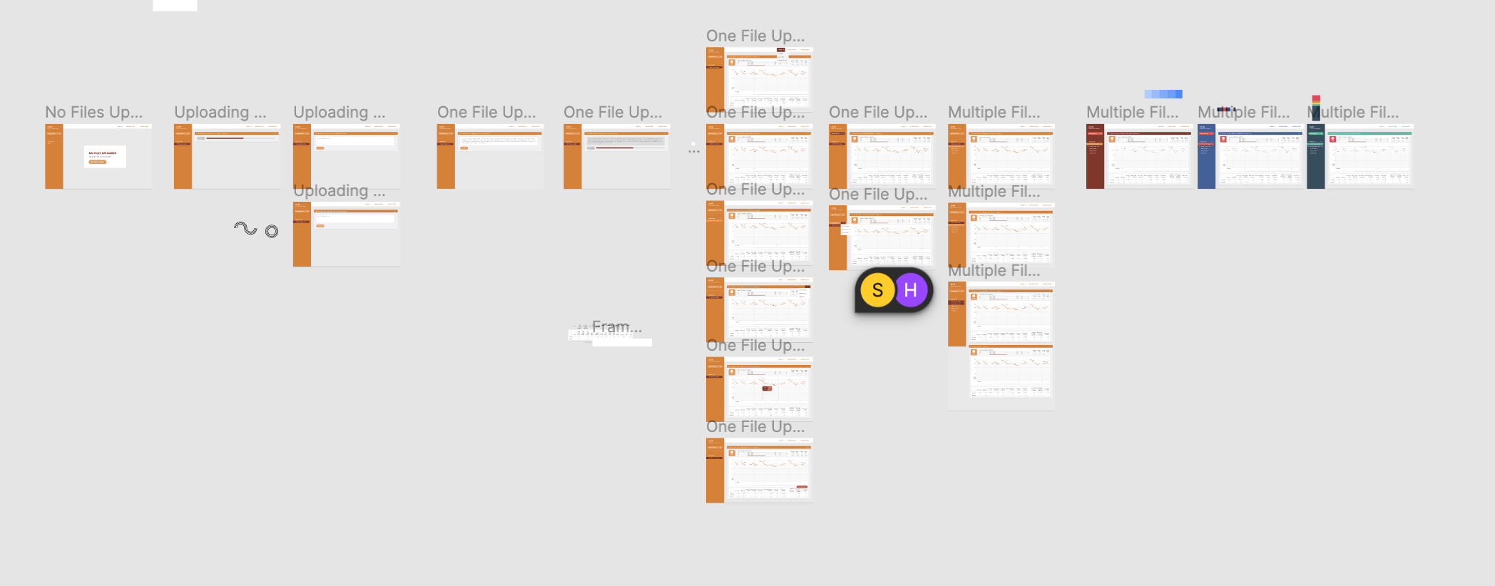
Afterwards, we made low-fidelity prototypes of the design. We decided to use a highlight color- blue- to help create depth and provide a unity for the design (However, we ended up later changing to orange to match the brand identity of SpokenWeb).
This one had a static bar in which one could upload and select which files they wanted. The main section had a dashboard in which one could see the data for the selected file.

This one had a more classic feel, closer to the original feel of drift. However I did include some updates to make the user experience smoother, including a pause/play button.

When testing, my mentor found that she liked the sidebar, but thought that it didn't allow for visual comparisons to happen between different data-sets. Additionally, she wanted a separation between the selection bar and the navigation bar.
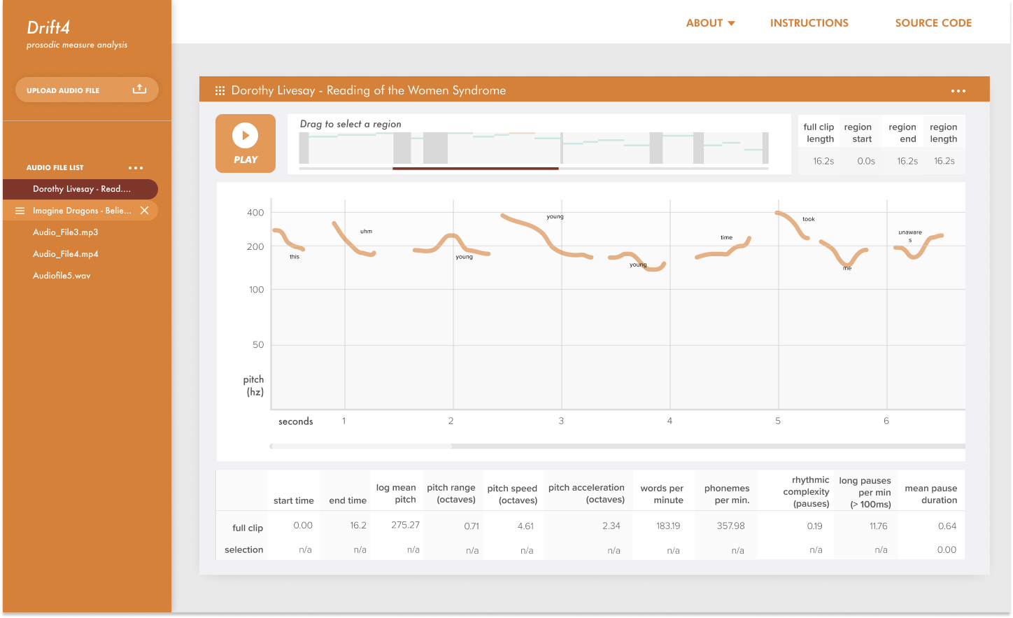
Based on feedback received, I created a high fidelity prototype in order to refine the design and to begin user testing. In this design, we switched the main color to orange to become consistent with the SpokenWord style guide. Additionally, with the help of a front-end developer, we created a client for users to test.
On Jun 5, 2021, we held a user testing session. Overall, much of the feedback we received was not for the digital design, but for the microinteractions. Some key feedback that we received was:

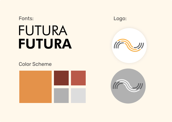
We matched our visual branding, including color schemes, fonts, and graphic elements to match spoken words style guide. Additionally, I created a new logo/icon to reflect the new visual direction and updated style of drift.


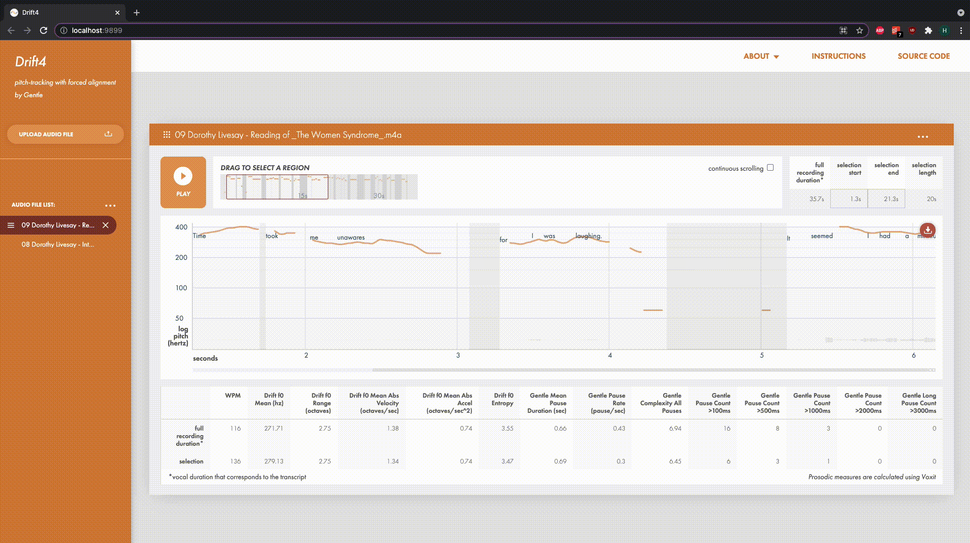
After we received this feedback, we created the final Drift4.0 to launch. As of right now, the developer and researcher behind drift are working to create an distributable version of drift4, which will hopefully be available by August 2021. The users of drift3 will hopefully be able to switch to the new version nationwide.
As one of my first projects I got to see fully developed, I learned a few things: